Somewhere Over the Rainbow: Working with Color
Sitting in my home office with a rainbow perched in the window broadcasting a message of cheer to passersby, it has me wondering what the new horizon of offices will look like. There is no doubt there will be changes afoot, but one thing has become clear as day-- the world needs color to lift it up.
For now, we suggest pulling out art you might have in storage for a home office refresh, framing a child's drawing, or setting out favorite objects as tiny sculptures. When those spring flowers start to peek out of the ground, snip a single bud for your desk. You can do for yourself what we have the privilege of doing for others on a larger scale professionally. This time is a true testament of how productive we can be when empowered by things that bring us joy.
The Office Spectrum
Art in the office is an extension of that joy-- grounding the space, unifying the team experience, and uplifting morale. While there is no place like home, going to the office can be the next best thing, so why not pay attention to the way we use color?
The current trend is to create a palette of colors and stick closely to it when doing an office refresh. This color code shows easily discernible changes in the atmosphere, assists in wayfinding, and ultimately aids the psychological well-being of the occupants. Picking tones in different spectrums allow for easy coordination with decorating finishes like wall coverings, carpet, furniture, and most importantly to us—artwork. We recommend choosing hues that are complementary to one another yet fall in different color families.
Example palettes that we've seen trending:
Teal, Plum, Lime Green, Magenta
Navy, Cadet Blue, Oxblood, Eggplant
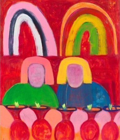
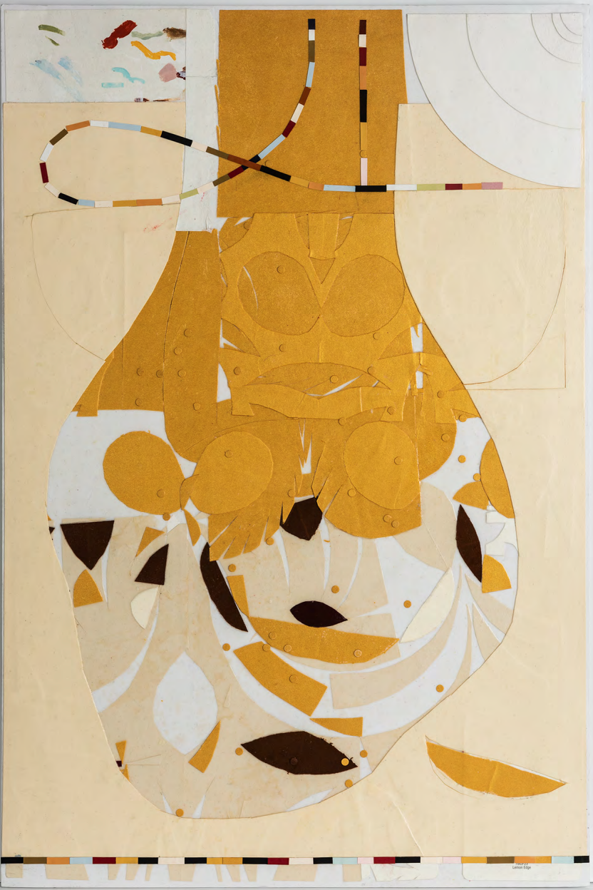
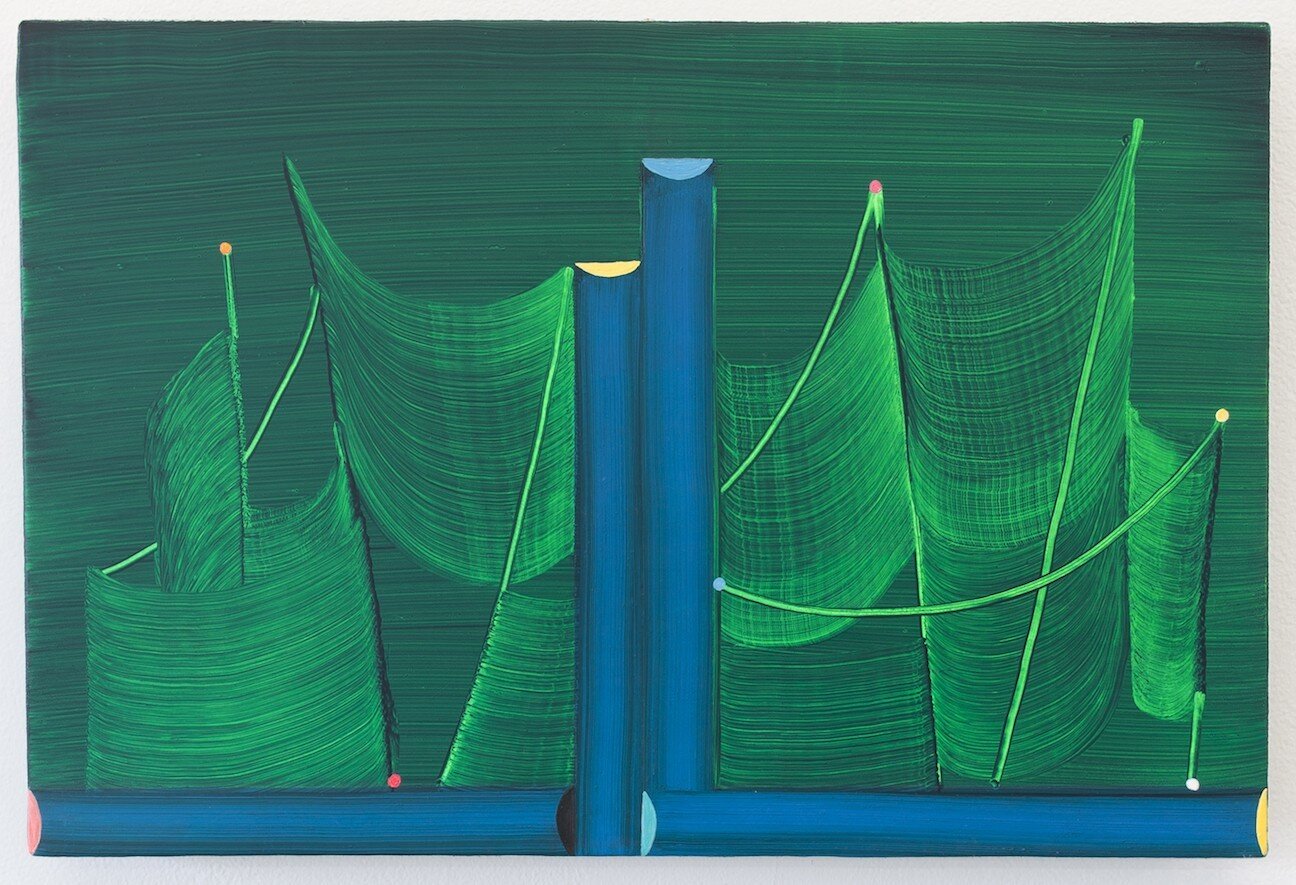
Emerald, Burgundy, Blush, Gold


Why so Blue?
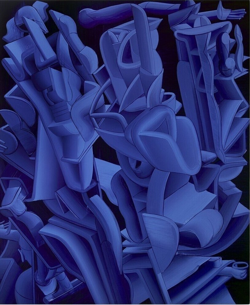
Another interesting way to address color in the workplace is to explore their cognitive effects. Blue is the most productive of colors and portrays logic, communication, and intellect; blue is often used on logos and is commonplace in professional settings. Similarly, red exemplifies courage, strength, and excitement and is opted for by companies looking to project power.
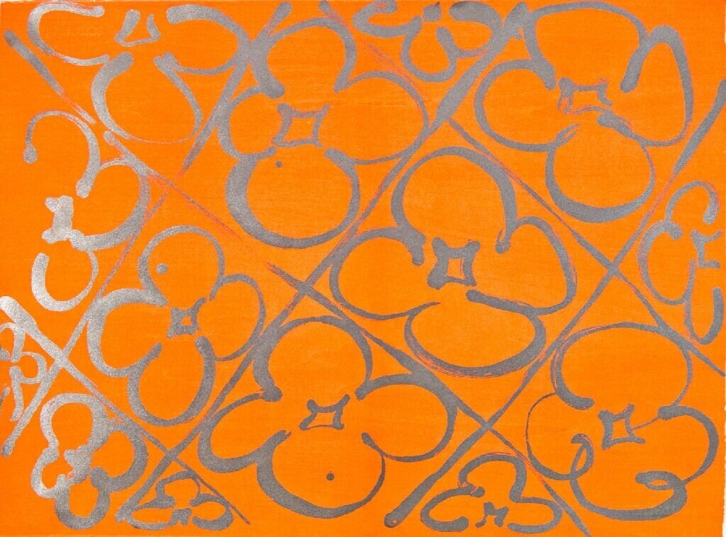
Not as commonly seen, orange can improve focus and provide comfort, making it a great choice for lounges or kitchen areas. Yellow projects positivity, creativity, and happiness; when used mindfully it can bring a ray of sunshine to spaces that might not have the benefit of natural light. Nature-driven green can bring balance, contemplation, and restoration, making it a great choice for the wildly popular addition of wellness rooms in contemporary offices.
Lastly, we can't talk about office colors without mentioning grey. It is both neutral and sleek, carrying with it a timelessness. That said, its overuse can border on depressing when implemented excessively. There have been some moves in the design world to leave it in the past, instead favoring bright whites, but grey is likely here to stay. Let's just make sure we keep it up-to-date with some touches of other colors, and yes, art can do that for you!
. . .